Friday 30 March 2012

Mattias Adolfsson


Mattias Adolfsson is a freelance Illustrator living in Sigtuna just outside Stockholm Sweden. Originally he had odd jobs which linked to his Masters of Fine Arts in Graphic Design, at HDK, school of arts and crafts Gothenburg. This lead him to work within the computer games industry. He first worked with a small game company and did jobs like game design and making the visuals. He even made a game called Kosmopolska 1998. Then he moved on to work for a larger company. The company worked within EA. These jobs didn’t stimulate Adolfsson as he worked with more technical, doing jobs like programming which lead to him leaving the gaming industry in summer 2007. 


Working at home in his converted garage Adolfsson works at least 5-6 hours a day. He fits his work and family life together. I am mostly interested in his surreal architecture pieces. Normal everyday activities like walking and jogging outside generate Adolfsson’s interesting ideas. He does’t have a clear image in his head when he starts and he allows his drawings to evolve. He admitted working so spontaneously can sometimes be a problem, especially when he starts drawing on a small piece of paper and he need to lead it onto another. 
He doesn’t use photo references, only sometimes for commissioned pieces. He either used his own observational studies or allow the drawing to create itself. 
For inspiration he listens to american university lectures. One of these lectures was about the illustrations in Tolkien’s books. Traveling is another big influence. He likes old fashioned buildings, especially with a history. Visiting any old town inspires Adolfsson to draw instantly. When asked where he would like to travel to next he answered Scotland or anywhere with a history. Adolfsson did originally start out to want to be an architect. However his passion for old fashioned buildings did not link well with creating more modern structures. 

He doesn’t necessarily created his illustrations to sell. He likes to work with his originals as much as possible before selling them on. Alot of his illustrations are held within his moleskin sketchbooks. 
His Moleskin sketchbooks have become a form themselves. These personal objects are final pieces themselves with many of them being displayed in many exhibitions. They are small sketchbooks jam packed with fascinating original drawings. Tiny details and wonderful watercolors. He even features on the official moleskin website. Moleskin uses Adolfsson’s creativity to advertise their products. They put across the idea that maybe you could be as creative and draw like Mattias Adolfsson if you also had a moleskin sketchbook. Adolfsson has also designed a cover for a Moleskin 2012 weekly planner. 
He recently released his first personal book, published by Sanatorium. It’s called “The first in line”, which is based on his sketchbooks,. Its a 160 page hardcover. A collection of his beautiful imaginative sketches. Full of ideas and wonderful characters. 
“Mattias’ brain is where Tim Burton meets Richard Scarry. His drawings are elegant and witty and insanely imaginative but most of all they are enormously inspiring” Danny Gregory
Danny Gregory, illustrator who is the managing director of a major NY ad agency, created award winning campaigns, author of 5 books and his illustrations have appeared in the New York Times and many other publications. 


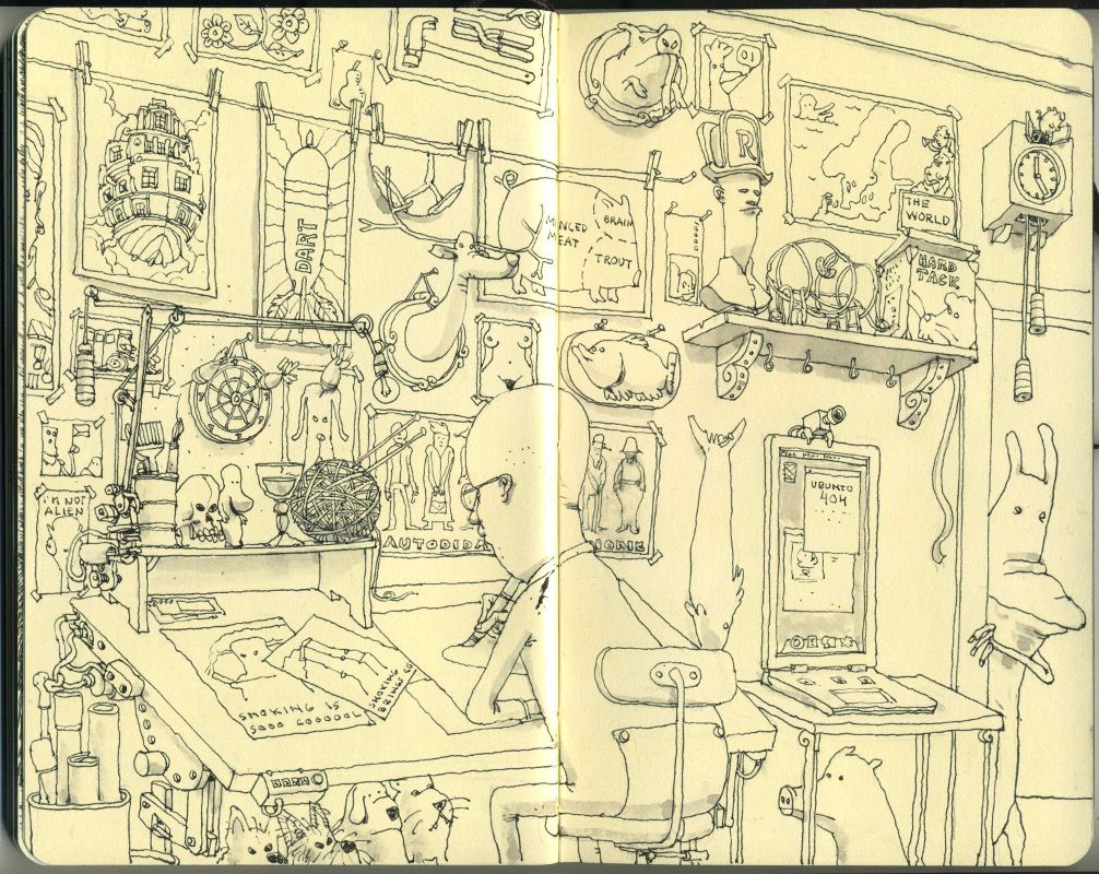
Mattias Adolfsson’s drawings have an incredible amount of detail. Every time you look back at his drawings you see something different. A new window, a new button. This excites me. However it is not just the detail. I could go into a gallery and look at a detailed study of a building and i would not feel the same. His buildings are his own inventions. They feel alive and each one has it’s own personality. His architecture is allowed to physically move, something that being an architect would not have allowed him to do. Being an architect may have limited his imagination. He is a successful illustrator because he balances both skill and concept well together. 

Adolfsson describes his process as “medieval”. With so many digital elements used today, Adolfsson likes to stay away from the digital world. Also working within the game industry has put him off. He used watercolours and ink. His fountain pen is his favourite tool. This must help him to be so spontaneous as with inks you cannot remove the marks you have made with a rubber like with pencil. So you have to be brave and just go with it. 
The fountain pen he use now is a Namiki Falcon with a fine nib. He has also made a series of illustrations using coffee. Most of his illustrations remind me of old fashions children book illustrations. This style reflects his interest with older architecture. 

Two of Adolfsson’s main inspirations are Piranesi and Kjell Aukrust.  
When looking at both artists i could see a visual link with Adolfsson and Kjell Aukrust’s work most. Aukrust is most famous for his work on the Norwegian animated film “Pinchcliffe Grand Prix”. Adolfsson first watched this animated children’s movie when he was 10 years old. This is obviously something that has stuck with Adolfsson. Adolfsson even did his own version of the car.


Piranesi work is alot more detailed. More shading involved. However he is similar to Adolfsson as they both in someway started out in the architecture world. As one of the greatest printmakers of the eighteenth century, Piranesi had practical training in structural and hydraulic engineering and also had the knowledge of perspective construction and stage design. Although not being very successful with architectural commissions all this knowledge became useful for his art works. Allowing him to create complex buildings that could only exist in dreams.


Although Piranesi is most famous for his views of the ruins of ancient Rome. I personally like his Prison’s the most. They are more complex and mysterious. They hold movement and remind me of scenes in movies today. This Prisons have influenced movies like Blade Runner and the moving staircases at Hogwarts in Harry Potter.  In today's architecture, you see Piranesi's imagination in the Tate Modern.

Sunday 8 January 2012

Image and Text (ITAP 9)

In visual communication it is very important to look at text as well as image. Text and image can relate to each other in various ways. Adding text can make the image more readable and easier to understand, however adding text can also add confusion and thought like RenĂ© Magritte’s “This is not a pipe”.

Text can be a powerful tool which can change the meaning and understanding of an image. Another factor which can change the meaning of an image, is the place where the image is placed. An english person who can not speak or read french would only look at Magritte’s painting and admire the skill of the painting. It is only when the text is translated to english that the puzzlement starts. 

Where would you find the photograph of the house above? In an estate agents, ready to be sold to a loving family? Or stuck on a wall at a police station as a crime scene? Each place makes you look at the image differently. When at an estate agents, i notice that the photography is quiet bright, with the house painted in a lime green. The photograph must have been taken on a fairly sunny day. However when i think of the image in a police station, i notice the brown bordered up windows and doors. Then my eye catches the tilted .... above the front bordered up door. 

The amount of image you can see can also change its meaning. Where and how much the image has been cropped. For example, the photograph above has been cropped. Here it just looks like profile portraits of a woman. On the left hand side, she look sad with her head tilted down and the expression on her face. Its not until you see the full image below, that you realise that the photograph is actually a mug shot. Where as before you thought she was just a normal woman, now we are wondering what crime she had committed. 

An image combined with another can also change and create a very strong message. Peter Kennard created this image titled “Blairaq” in 2006. It is a controversial image which was used in may newspapers. Without the background the image is innocent with Tony Blair taking a photograph of himself. However by adding the background the new image is very powerful and holds a strong controversial opinion about Tony Blair. 
“We wanted to mark Blair’s last week in office with a graphic attack on him,” Peter told Socialist Worker”

“In many ways the act of producing and showing the work is a cathartic process, one by which you get out all the frustration that you feel about the war, and Britain’s role in it.” http://www.socialistworker.co.uk/art.php?id=12201


Similar to Peter Kennard, Alison jackson has also used photomontage in her controversial work. This Image of Prince Philip at an art gallery has been turned into a humorous piece just by changing the images Prince Philip is admiring. Most of Jackson’s recent work is based on celebrity culture and creating believable photographs. Her work is very comical. 


The Experts (ITAP 8)


Jonathan Barnbook once said that “it is far more important to do the work that you are excited by, not work that you feel you should do”. I agree with this quote as creating work you are interested in drives you forward to keep creating better work. When you are excited by the work, you don’t think of the work just as a job or university work, but as fun. The quality and quantity is much larger because you are enjoying the work. This is a good point to keep in mind when choosing projects for yourself to do. I also think challenging work comes hand in hand with exciting work. If we only did work that we knew we could already do, then we are not learning anything new. The work will then get a little tedious. 
So i agree that we all need to make our work exciting for ourselves personally, however when doing university projects there is always something we don’t like doing. I personally don’t enjoy writing essays. But if i only did the work i enjoyed and never attempted written work like essays my whole body of work would be affected. So when looking at the quote with this point of view, i find that all work is important and should be completed. 


Thursday 5 January 2012

Production (ITAP 8)

Illustration started as early as the prehistoric times with cave paintings. As time has gone on and technology and access to materials has improved, so has illustrations. 
In the 15th Century the most popular method of producing illustrations was using woodcuts also known as xylography. The illustration are carved into the surface of a block of wood. The white spaces in the illustration are cut out of the block leaving whats left of the surface   to be covered in ink with an ink roller and transferred and pressed to paper or fabric. 
I have never attempted using woodcuts, however i have used lino instead. The process is very similar with the lino just being easier to cut into. These methods can be challenging and need a large amount of concentration, as you need to expose the correct surface. Its the opposite to drawing where you make the marks that make the illustration, whereas here you are cutting around the illustration. So it can be an easy mistake to start cutting away your illustration. Woodcuts were and still can be a helpful process of making many prints using one block cheaply. 

My experiment with Lino Printing  

In the 16th and 17th century etching became the new popular process. Similar to wood cuts, etching uses metal plates and acid to expose specific parts of the surface. Metal covered with a wax is used instead of wood. As the wax is resistant to the acid, parts of the wax is removed from the surface in the same way was wood is cut from wood cuts. The metal plate is then dipped into a bath of acid. Where the wax has been removed leaves the metal exposed to the acid for the acid to bite into the metal and leave behind a sunken part in the plate. Finally like the wood cut the metal plate is inked up and then put into an inkpress. Wood cuts are too large for this giving metal plates an advantage to produce better print quality when used with a high pressure ink press. 
Then in the 18th century saw the creation of lithography which uses stone instead of metal. The stone produces a smoother print. 

Sunday 1 January 2012

Storytelling (ITAP 7)


Harry Potter is a world wide success. What were originally a series of seven novels written by J.K Rowling, are now movies, games, merchandise and even a theme park. With these movies dominating our cinemas for a decade it is know wonder why it’s fans are so addicted to the story. 


Along with the movies there are games such as board games, trivia games and videos which can be played on all consoles and gadgets. 


Everything seen in the movies are available to buy from wands to personalised acceptance letters to Hogwarts. 


As 2011 saw the end of the very last Harry Potter movie, J.K Rowling and her team created a new website called Pottermore. It is described as a unique online Harry Potter experience and promises new and exclusive information about the world of Harry Potter. 

Three Act Structure (ITAP 7)

Jean-Luc Godard famously once said “Every movie needs to have a beginning, a middle and an end, but not necessarily in that order.” This made me think of the layout of a normal week starting from Monday and ending with Sunday. There are not a lot of movies that run all the way through without showing either a flash back or the future. ‘Premonition’ is a perfect example of this quote. The movie starts at the end of the story when protagonist Linda finds out her husband has died in a car accident the previous day. Linda awakes the following morning finding her husband alive at home. She realises that she is living her days in the wrong order. Everyone else is carrying on like normal and believe Linda is insane. 
So the movie ‘Premonition’ does have a beginning, middle and end but the story is told as
end - middle - beginning 
Instead of living the week as Sunday, Monday, Tuesday, Wednesday, Thursday, Friday and Saturday Lisa week is Thursday, Monday, Saturday, Tuesday, Friday, Sunday and Wednesday.


All movies are told in 3 acts. 
Act 1, the beginning, characters are introduced and are equal. This act does not end until the protagonist (main character) makes a commitment which lead to the main action of the movie, acts 2 and 3. 
Thursday - Linda finds out her husband died the previous day.  
Monday - Linda finds her husband Jim alive. She meets the Sheriff that told her that her husband died and strangly the Sheriff does not recognise her. Has never met her before. 
Saturday - Linda finds some pills in the sink and a bottle with a doctors name on it. She finds that one of her daughters have got scars all over her face. She has no idea how her daughter has got these scars. Today is her husbands funeral. She notices a strange woman. Her name is Claire and says they talked the day previous. Once home she looks for the doctors number. She can’t call during weekends. The doctor arrives with assistance and they think Linda is mental as she can not remember how her daughter got the cuts. They take Linda to a mental health care facility. The doctor recalls Linda's visit from Tuesday, when she claimed her husband was already dead.
Act 2, the middle, the characters begin equal and something happens to disturb this. This starts a sequence of events. 
Tuesday - Linda wakes up at home instead of mental health care facility and finds her husband. Her daughter is wound free. Linda then visits the doctors. He doesn’t recognise her. She tells the doctor about her husband Jim dying. She gets prescribed drugs and goes home. Next Linda goes to her husband work place and suggests that the family need to get away for a break. This is a bid to save her husband. She sees Claire, the girl at funeral. When she gets home she puts the pills down sink. Then her daughter runs through a glass door and get her wounds. Finally on this day she makes a note of what days she has lived so far and what days are to come. She tries again to convince jim to stay and not go on his business trip Wednesday. 
Friday - Linda wakes up realises its friday and remembers this is the day that her and Claire speak. She visits Claire and ask’s her about Jim finding out that him and Clair where about to have an affair.  
Act 3, the end, the protagonist changes or grows emotionally. All events come to a close.
Sunday - Linda reflects on what has happened and what may happen and is wondering what to do. She eventually tells Jim that she had a dream that he died. Another attempt to make him stay and save him, however he only replied with “It was just a dream”. There is only one day left, Wednesday. Jim could die tomorrow. 
Wednesday - Linda wakes up and doesn’t want to believe its Wednesday. She rings a friend to conform. She finds a note from Jim and he has already left. She runs after him and rings and ask him to pull over. She is by the scene of the accident and ask him to turn around panicking. He does and narrowly misses another car. He stops but cant start the car again while there is a trunk approaching. Linda screams and watches the accident happen. Linda’s husband dies. 


Interpretation and Medium (ITAP 6)

Books are fascinating objects. A physical item made up of paper that hold a whole world within it. Containing people who we have never met and places that we have never visited, we can feel safe in these books letting our imagination run wild. Books allow us to be individuals, letting us create different fantasies. Even though we can read the same book and there are no written variations, we all invent different worlds. Illustrators are able to visually show there inventions to other people through the use of drawings. 
Alice in wonderland is a very popular children's story. Author Lewis Carroll and first published in 1865 Alice in wonderland was originally called ‘Alice’s Adventures in Wonderland’. There are many different interpretations of the novel from illustrations to films. In these illustrations and films you can see how believes, political views and also the technology available at the time have influenced the pieces. 

Sir John Tenniel 1865
Sir John Tenniel created a series of 92 illustrations for ‘Alice’s Adventures in Wonderland’ in 1865. They are black and white illustrations showing that colour printing technology was not widely available. His illustrations were engraved onto wooden blocks and prints would be made in the wood engraving process. Tenniel is also well known for is political illustrations. His style is very cartoon like which reflects in his Alice illustrations. 

Arthur Rackham 1907
Arthur Rackham created his colour versions in 1907. Rackham would sketch out an outline, lightly block in shapes and details, then finally add pen and indian ink. These illustrations are more realistic than Tenniel’s. They are more sophisticated and childlike. Alice herself is smaller than the animals, which really over exaggerates Lewis Carrols world. However even though the illustrations are colour they are still quite dull and dark. 
Jessie Willcox Smith
Walt Disney 1951
Jessie Willcox Smith’s illustrations are a lot more vivid. These bright and attractive drawings remind me of Walt Disney’s ‘Alice in Wonderland‘. Maybe this is where disney’s inspiration came from. Both Alice’s look very similar wearing the same light blue dress and a white apron.  Alice has now turned into a very childlike character, speaking queens english, gentle, sweeter and more colourful. As Disney’s productions are very popular this is one of the most recognisable versions of ‘Alice in Wonderland’ 
Tim Burton's Alice in Wonderland 2010
The most recent version of this story is Tim Burtons film ‘Alice in Wonderland’ released in 2010. This film see’s the return of Alice to wonderland, where Alice is the age of 19 and has forgotten her previous visit. As a 3D movie Tim Burtons has over exaggerated the story with his own style. For a disney production, the movie is dark and mysterious. When watching the making of this movie i learn the thinking behind the mad hatter. Both the actor Johnny Depp and Tim Burton largely participated with both of them creating illustrations of what they thought the character would look like. Deep also researched real hatters and found that in the glue they used there was a high mercury content. This would physically and mentally effect them. Staining their hands and eventually mentally driving them mad, “mad as a hatter”. All little details were looked at when creating this character. The mad hatters eyes where vivid bright green lens, with one of the lens slightly off centered. This created the impression that the mad hatter was never looking straight but always slightly further. Also these eyes where enlarged along with the red queens head. 
CGI and motion capture played a big role in the making of this movie. All characters where in some way edited except for Alice, who was 100 percent real through out. This really exaggerates that the world Alice has fell into is not real. 


Lewis Carols story through time has been scrutinised, especially now because of what is thought of us of drugs. When Alice first meets the Caterpillar he is sitting on a mushroom while smoking a hookah. He also encourages Alice to eat from the mushroom to change her size. This implies that the mushroom is a magic mushroom.  
There has been a smoking ban in the UK since 2007 and the Caterpillar could be seen a glamourising smoking to young children. In Tim Burtons movie he seems to tackle this problem. The Caterpillar still smokes however with the Caterpillar constantly blowing smoke in her face you see coughing Alice get irritated and say ‘Will you stop doing that’.