Monday 31 October 2011

Tone of voice (ITAP 5)

When looking at a single word on a piece of paper, and then being asked does it has a tone of voice, can be a puzzling. A word alone can not physically speak, so how can it have a tone of voice? However when thinking about adverbs, makes this question easier to process. How can we visually see a word that describes something? Can we make a word mean something different visually? 

I have tried this in the past. I visually shown the word big, being that big it did not fit into the frame i created for it. I wrote the word lonely separating the first letter L from the rest of the word. 


When creating our magazine we need to think about this. As our magazine is about christmas, we will need to show this in our main headings and titles. Using typical christmas colours and items. 


Legibility (ITAP 5)

Legibility means something that is clear and capable of being read. Its contexts can be used in any situation, maybe drawings or a kind of ordering. However this word is mostly connected to writing. Whether it is handwriting or typography. Its very important that not only yourself but your audience can read and understand your piece of work. 
Even the way we compose our sentences and articles are clear. We are taught to read and write from left to right. If i started to write the rest of this blog from right to left, would you be able to read it? It would take you much longer to read, and your concentration would be much higher. Would you give up reading after a while? I know it would take me longer to write from right to left.
Not all people read and write in the same way as we do. For example many east asian cultures can write horizontally or vertically, like chinese. In english culture, you would only see type that is vertical for advertisement reasons. You would never find a casual note in this way. Another example is the Qur’an. Arabic is written from right to left. 


Punctuation exists so that our writing is more clear and ordered. Full stops are taken for granted. If you wrote an essay without full stops and gave it to someone else to read out, they would not know when so pause and take a breath. 
Design aspects like font is also included in legibility. There are a thousand different fonts we can use but if we choose a different one for each word, this would distract the viewer. Also some fonts are not clear and are unreadable at smaller sizes. Some fonts are designed for header use only. 


As a illustrator i am a visual thinker and reader. I can sometimes read and understand a lot more from a image than a piece of paper filled with text. Maybe i’m lazy? I recently went to an exhibition in the Ikon gallery, birmingham. I looked and studied paintings, drawings and sculptures but i only glanced at the wall filled with text, a story, once. 
Adding a relevant image can also make your text legible. Words alone may not be as effective as with a image. 


Saturday 29 October 2011

Research and Inspiration (ITAP 4)

Research and inspiration come hand in hand. I personally don’t think you can have one without the other. To do research effectively you need to find people that inspire you. If you research an artist that you don’t like you are likely not to take any ideas or techniques and use them in your own work. Also nine times out of ten you will not find someone inspirational without looking for it first through research. 
You need to always be interested in your work. Use things you like and find fun. Paul Davis quoted “Boredom is the enemy of the artist”, which is very true. If you have no passion for what you are working on, what is going to drive you on?  
At university i am doing a magazine for christmas. As an illustrator i have decided that i want to create my own character which i can use constantly through out the magazine and maybe for the ten second moving image promotional piece to promote the magazine.

Through messing about with photography and christmas decorations i found that a small nutcracker was my favourite item. Its perfect, very festive, has a story and i can try and give it personality. So how do i turn it into an illustration? I don’t want to just draw the nutcracker. I want people to look at my character and remember it. 
My own photograph. Where the nutcracker idea began
This triggered me to think of example of characters from books and movies. Pixar, Disney, dreamworks and Tim Burton where my main inspiration. As i am inspired by them i instantly started researching, looking at what different shapes and proportions they used. I then translated this into drawing different examples of what my nutcracker character could look like in their styles. Tim burton’s huge eyes and stick thin animations made my nutcracker look too scary, which makes sense as his ideas fit in with a halloween theme. This would not help me for a cheerful christmas icon. Pixar became most helpful. Pixar’s eyes are able to show many different emotions and look most realistic with both iris and pupil included and not just the pupil.

Pixar - Toy Story 
Disney - http://www.animationarchive.org/email_07_02_16.html
www.timburton.com
My sketchbook - designs for nutcracker using research


The audience for my magazine is aimed at parents, mostly mothers. The people that make christmas. So i need to make sure my nutcracker character is made for them and that it doesn’t look too childish. Maybe choose a style of drawing that parents of a certain age recognise from their childhood. Taking modern animated characters and combining them with the past. 
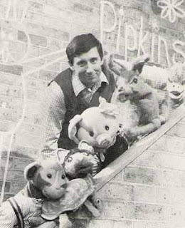
I asked my parents for their favourite childhood characters and programs. My answers where Bagpuss, Rainbow, Pipkins, Itsy and Bitsy, and Fraggle Rock. All these personalities were physical objects like teddy bears, hand puppets.  Whereas today most things are computer generated. 


Bagpuss

pipkins

Rainbow 
Also in my group we have decided that we want a vintage theme to our magazine. The nutcracker itself quite vintage. So by also looking at past children characters will also add to this.
Everything i have talked about in this post is an example of research and inspiration. I have took animated movies i like and used them in my own work. I have stretched my skills and challenged myself. I have found that the process involved in creating a character is much more difficult than simply creating a one off illustration. 

Saturday 15 October 2011

Theres a Time and a Place (ITAP 3)

The time and places images are used and shown is highly important. Even at the same time, countries have different cultures. There are different beliefs, bans and acceptances. Right now in the UK, smoking is took very seriously. Its frowned upon. In the 60s smoking was fashionable. All 60s ikons smoked and were seen and advertised smoking, making the public want to do the same. Smoking was seen as glamourous. However as our knowledge has been improved with science and technology, we now know smoking is harmful to us. 
With most public spaces free from smoking, advertising is also tightly controlled. Images of people smoking are not seen as often, usually only when it is linked with anti smoking companies. The main worry with showing these images are the effect that it can have on influence young minds. Even photoshoped images are being scrutinised as our children want and try to look like the edited models.
Whereas in Italy and similar countries smoking is not as restricted. Their bans are not as tightly reinforced and smoking is still seen in many fashion images, like italian vogue. 

Italian Vogue’s July issue

Recycling (ITAP 3)

It is nearly impossible to be 100% original. When trying to create something totally new, most of the time you will find someone that has done the same or something similar in the past. So instead it can be better to look at the past first and then change aspects or interpret it differently. 

Both Matteo Bertolio and Mike Ruiz work within the fashion photography industry. Another similarity is that they both used the 60s art movement of pop art to create some of their pieces. Matteo Bertolio piece for Tank Magazine in 2004 shows similarities to Andy Warhol’s Marylin in 1962. I highly doubt that this was just coincidence. He has used Wahols contrasting vivid colours to create a bright eye catching piece of photography. I too believe the same with Mike Ruiz works for Zink Magazine called “Masterpiece” in 2006. The dots used throughout his work instantly reminds me of Roy Lichtensteins famous work. Both have used pop art and brought it to our current time. By using better technology like our highly technical camera and computers, the images are even more powerful and distinct. The photos give a glossy and smooth look, which goes with our current elegant fashion photography. 

Matteo Bertolio -Tank Magazine 2004,Andy Warhol - Marylin 1962

Mike Ruiz - Zink Magazine “Masterpiece” 2006, Roy Lichtensteins 

However some artists take a past idea or art work and just recycle it. Sometimes they don’t even change a lot about the original image. This is mainly done in advertising. We recognise the images and connect to it more, making their brand more rememberable. For example, this image from the Focus Catalogue in 2009 connects to the story of adam and eve from the bible. Most people know this story and have seen Lucas Cranach famous painting. It has used exactly the same objects and composition as Cranch’s painting. The only different is the method that the image has been made. Cranch’s painting and Focus’ photography.


Lucas Cranach - Adam and  Eve – c.1520’s , Focus Catalogue - 2009 


Another example is the Royal Shakespeare Company advertising Hamlet. The background is from Casper David Friedrich painting called “Wanderer above the Sea of Fog,”. The advertisers has cleverly imported their main character for the play into the painting. The other difference is that the figure is facing towards us the viewer, instead of faced back towards us like in the original painting. 


Casper David Friedrich - Wanderer above the Sea of Fog 1818, David Tennet – RSC Hamlet - 2009    

Thursday 6 October 2011

Lets be creative (ITAP 2)

As most art students know being creative is not just about making attractive images. Actually being involved in art has nothing to do with making pretty pictures at all. The soul purpose of art and design is to come up with something visually interesting which solves a problem. Sight is one of our main and most important senses. So looking at image can have an effect on us emotionally. This makes us think, what can i do? whats similar about me and this image? Do i need that? Do i want to read the article next to it?


When solving problems visually the first and most important thing to do is research.  Someone would have solved this problem before. How did they do it? What inspired them? What did they use? Did is work effectively? Then using this information we can come up with our own ideas and make sure that we don’t solve the problem in exactly the same way. Looking at the same kind of work over and over will get boring to our audience. The solution needs to be new, and stand out from the rest. Art and design is a competitive workplace like most. So we want to make sure our design is the winner and most effective. 
When Solving problems we need to beat assumptions and approach the subject open minded. Just because your specialism maybe me illustration doesn’t mean you cant include photographic and graphics. Is also doesn’t mean that your limited to just pencil and paper. We need to experiment with everything. 

http://sampaints.com/
Sam Weber is an illustrator who uses ink, watercolour and acrylic, which is then manipulated in photoshop. He is working with both hand and digital. Most of his works look like they are aimed at fictional books as his illustrations have a fantasy element to them. The watercolour adds a gentle and emotional feel to the illustrations which most likely connects with the emotion of the book.


http://sampaints.com/2011/06/six-months-three-days/
Weber’s illustration above was created for a short story called ‘Six Months, Three days’. The title alone doesn’t describe a lot about the book. It could be any genre. However when you see the beautiful illustration it instantly show its a romance with two characters closely drawn together . Then the bright white line structure around the couple gives the sense of science fiction, as the structure looks like something out of a circuit board. however when reading the blurb, i realised that this line structure is all the possible futures the woman can see. 
http://www.christophniemann.com/


Christoph Niemann is a witty illustrator and completely different to Sam Weber. Where as Weber is gentle and soft with his illustration, Niemann is bright and bold. His illustration could also be described as graphic designs as the sharp and smooth look of them gives the impression that they have been created using computer programs.
Yet my favourite illustration of Niemann’s is one called ‘LET IT DOUGH!’ (left). This very amusing piece has been created using photography, a lump of dough and pastry cutters. In some ways it could describe the christian view of God creating the world in seven days. It also reminds me of a child at play, using the cutters and decorations to make faces. As the first few images made me laugh this lead me to keep on looking at all the rest, meaning that humor is a very effective tool to attract an audience. 


To be creative we need to be inspired. This can be from a number of different factors like culture, personal interest and the environment around us. The environment which inspires you can be as small and personal as your bedroom. Most artists has a favourite place to create artwork. These places are usually where they feel most relaxed and comfortable. Even in the workplace employers collect personal items like family photographs to display in their own areas. I have two preferred locations i like to work in.
I personally find writing about anything really difficult. I have to give my full concentration. So to avoid distraction, i go out in the garden in the warm sunshine, where there is no technology. With no TV and no internet connection, the only thing i can do is type and think. However when it comes to creating art piece, the garden’s elements do not meet the standards i need. The bright sun light on a plain piece of paper reflects to brightly for my eyes. When painting, the colours that have took ages to mix, dry out instantly. So for this i go to my own little studio called my bedroom. A cool calm place with a relaxing pastel pale blue with music in the background. All my art supplies are easily reachable and i have many images pinned to cork boards which inspire me. I can be as messy as i like without the fear of a stranger walking in and tripping over while i’m in my trance.

Guy Denning's Studio

Sunday 2 October 2011

Why draw? (ITAP 1)

Drawing is a way of life. Its a way of thinking, communicating, and showing our ideas. Its a connection between your hand, eyes and brain. At 12 to13 months of age, once a child has developed muscles in there hand to grasp a pencil they will start scribbling, excited that they can make a mark on a piece of paper. 

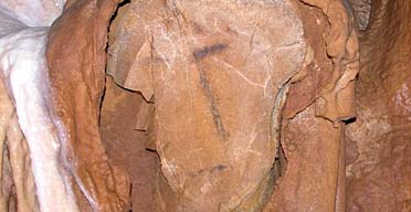
Even in prehistoric times there was art. In 2006 archaeologists found a 27,000 year old drawing of what looks like a face, in Angoulėme, France. This activity of drawing has been achieve with under developed brains. They would draw with a technique called stump drawing, which means using their fingers or a piece of hide. 
Cave art, France
http://www.guardian.co.uk/artanddesign/2006/jun/06/art

Drawings have also been very useful in recording information, especially when cameras where not around. Prehistoric cave drawing have helped us understand their lifestyles. We know that animals were extremely important, as many of their drawings were based on animals. 


http://www.bbc.co.uk/schools/gcsebitesize/science/aqa/evolution/evolutionrev1.shtml

Another example of science using art to record information is Charles Darwin and his theory of evolution. When he traveled to the Galápagos Islands he didn’t have a camera. He had to record the differences he saw in his finches by drawing them. 

Heart sketch


Another famous man who used art to r
ecord and think was Leonardo de Vinci. He was a scientist and engineer who used drawing to think and develop his ideas. As an engineer he wanted to know how joints and limbs worked together. In these drawing of hearts you can see he has spent a lot of time observing and record what he sees with the use of drawing. Around he has labeled and written idea he has had. This is a very busy piece of work. Then when explaining to others about his ideas he could show this piece of work. You can never truly explain a new idea to someone else and make them fully understand without anything visual to look at. With just speaking your ideas and trying to describe the image in your own head, the other person could be imagining something completely different. Also when he studying hearts, hearts themselves where not permanently available. He would need a very clear and detail way of remembering what the heart looked like. 

Drawing is also a way of problem solving. Before a product or a piece of art work is created, a lot of planning is involved. This prevents wasting money, materials and time. Leonardo also did this as he was hired by the Duke of Milan to create weapons for war. 

The brain is an organ which is key when we draw. We have a left and right brain. The right side of the brain is the creative side. The side that allows us to throw paint onto a canvas without us caring where the paint specifically lands. The left side however is the complete opposite. This side deals with organising, editing and classifying. The left side of the brain is studying the paint the right side has just placed and is criticising it. 
This doesn’t mean that in art that the right side of the brain is better. We need both, and our work gets better as we learn to use and turn off either sides at the correct times. When Leonardo was creating his weapons of war his right brain drew the drawings then the left side became involved writing notes on how to improve it and make it better. 

http://www.mi-zo.com/?n=portfolio&c=art&id=39&s=0

This piece of photography by Zoren gold and Minori is a perfect example of using both side of the brain. They have used their right side to experiment and bring in all sorts different props together and place them. Then the left side is included to help develop the image by standing back and criticising parts and rearranging. They would have needed to use both of their brain continuously and like a cycle. Going from right to left right to left. Experiment, criticise, play, organise, until the perfect image for them has been created. Until the left side of the brain can’t no longer see any faults. 

When developing our magazine for our project, we will need to use both principles and drawing and the brain to create it. We need to use drawing to plan the magazine. Sketching out many different layouts for the pages themselves, and using drawing to experiment with compositions in illustrations and photography. We need to use both side of our brains. The right to be creative and experimental with out layouts, photography, graphic designs and illustrations. Then we need to check everything using out left side of the brain. Continuously questioning ourselves that the magazine is hitting all our targets and making sure it is for our selected audience.